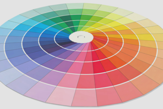
Colour is one of the most powerful tools in any maker’s toolkit. It shapes mood, highlights detail, and ties a project together in ways that elevate even the simplest handmade piece. No matter your preferred craft, working with thoughtful, seasonally inspired colour palettes can transform the creative process. These palettes offer direction, spark ideas, and provide fresh ways to enjoy making throughout the year. This article explores how to use colour intentionally and how seasonal tones can bring out the best in your handmade projects.
Why Seasonal Colour Palettes Matter
Colour is rarely just decorative. It communicates. It influences how we feel and how others interpret our work. This is why so many makers rely on seasonal palettes—because they reflect the natural world and the emotional energy that comes with it.
Seasonal colours are also a practical guide. They make the design process smoother by narrowing down options and offering a cohesive starting point. Instead of sifting through an endless spectrum, you can work within curated tones that feel anchored in time, mood, and purpose.
Embroidery and Thread-Based Crafts: Colour With Purpose
Embroidery relies heavily on colour. Threads act as paint, fabric as canvas, and each palette adds emotion to even the smallest stitches. Careful colour planning allows embroidered pieces to shift from simple decoration to meaningful, year-round art.
Planning Palettes for Thread Work
Because embroidery involves controlled detail, clarity is key. Defining a main tone, a highlight tone, and one or two supporting shades helps maintain visual balance. Seasonal palettes can provide immediate inspiration. For example, spring-inspired embroidery benefits from soft pastels, whereas autumn embroidery thrives on layered warmth.
Integrating Tools and Kits Into Colour Planning
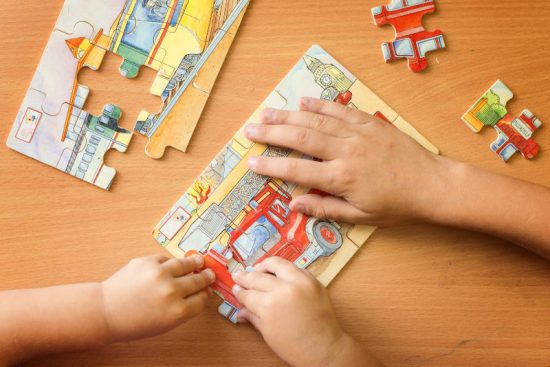
Many modern kits are built around curated palettes, making them helpful for beginners and experienced stitchers alike. This is especially true for those exploring new crafts, such as when trying punch needle kits for beginners, which often come with well-chosen shades that take the guesswork out of colour matching. These pre-selected combinations guide makers toward cohesive results while leaving room for personal creativity.
Spring: Fresh Beginnings and Gentle Contrast
Spring colour palettes revolve around renewal. Shades tend to be soft, hopeful, and bright without being overwhelming. These tones work especially well for projects that rely on lightness or subtle detailing.
Soft Neutrals and Pastel Highlights
Consider using warm greys, eggshell whites, and brushed beige as base tones. They create room for pastel accents—mint, lilac, butter yellow, and dusty aqua—to shine. A balanced blend of neutrals and pastels helps a project feel uplifting but refined.
Short bursts of bright colour can add interest without interrupting the calm palette. Think pops of fresh green or a muted coral. These accents introduce playful contrast while keeping the overall feel cohesive.
Textures That Pair Well with Spring Tones
Spring colours thrive in materials with gentle texture. Think lightweight yarns, linen fabrics, matte paper, soft fibers, or smooth threads. The subtlety of these textures lets the colours lead. Crafting with them results in clean, airy visuals that echo the season’s sense of awakening.
Summer: Vibrant Tones and Confident Pairings
Summer is bold. Days stretch longer, colours feel stronger, and creative energy often runs high. This is the season for punchy combinations and brave pairings that stand out.
High-Contrast Palettes for Impact
Contrast plays a starring role in summer palettes. Saturated pinks, oceanic blues, tropical greens, bright oranges, and golden yellows become the foundation of dynamic handmade designs. Pairing these strong hues thoughtfully—such as teal with sunny yellow, or magenta with emerald—creates a memorable visual statement.
Balancing Saturation with Grounding Shades
If strong tones feel overpowering on their own, anchor them with grounding colours. Charcoal grey, off-white, warm sand, or slate blue provide structure. They help vibrant colours breathe while making finished pieces more versatile.
Textures and Materials for Summer Energy
Summer colours embrace movement. They pair well with materials that reflect light or have fluid structure: smooth cotton, glossy threads, sleek beads, polished wood, or lightweight metal accents. The combination of bright colour and tactile shine gives projects a lively sense of depth.
Autumn: Earthy Warmth and Layered Hues
Autumn is rich with warmth. Handmade projects often take on deeper meaning as days get cooler and creativity becomes more introspective. Colour palettes from this season draw heavily from nature’s transition.
Warm Bases with Natural Depth
Rust, burnt orange, warm olive, chestnut brown, mustard, and brick red form the backbone of an autumn palette. These hues support each other effortlessly because they share natural undertones and a grounded softness.
Layering Tones for Dimension
Autumn lends itself to layered colour work. A project might begin with a warm brown foundation and gradually introduce copper, deep green, or soft gold. When layered thoughtfully, these colours create instant depth without requiring complex design choices.
Materials That Enhance Autumn Palettes
Wool, felt, textured paper, thick threads, and natural fibers amplify the earthy feel of autumn tones. Textures with slight irregularities—like hand-dyed yarn or rustic fabric—make colours appear richer and more dimensional.
Winter: Cool Elegance and Subtle Drama
Winter palettes evoke stillness, clarity, and contrast. While some people gravitate toward cool tones, others prefer warmth during colder months. Both can work beautifully as long as the palette remains cohesive.
Cool, Refined Tones
Frosted grey, icy blue, deep navy, crisp white, and steel silver create a palette that feels clean and structured. These tones work well for detailed craft projects where precision matters. They also complement geometric patterns and minimal designs.
Warm Alternatives for a Cozy Feel
For makers who prefer warmth, winter can also be expressed through soft taupe, chocolate brown, creamy ivory, muted burgundy, and charcoal. These tones bring comfort to handmade pieces and feel especially inviting in tactile crafts.
Materials That Shine in Winter Palettes
Think smooth clay, structured fabrics, polished wood, metallic accents, or thick yarns. These materials pair well with both cool and warm winter tones, offering dimension without distracting from the palette.
Textures and Fabric Choices
Thread type matters. Matte cotton threads soften a palette, while glossy rayon adds a hint of shine. Fabrics like linen, canvas, and cotton each change how colours appear, making it worthwhile to test combinations before committing to a final design.
How to Build Your Own Year-Round Colour Library
A personal colour library is one of the most valuable resources for any maker. With every project, you learn something new about how colours interact—and keeping a record of those discoveries makes your future work stronger.
Create Swatch Collections
Saving small samples of yarn, thread, or fabric helps you build a visual reference. Group swatches by season or tone to make planning easier. These collections grow over time and become a dependable source of inspiration.
Experiment Without Pressure
Not every experiment needs to become a full project. Try blending colours in small samples to see what resonates. Observing how two or three tones interact gives you clear guidance when starting larger pieces.
Use Nature as a Year-Round Guide
Nature offers endless seasonal cues. From spring petals to winter shadows, the world provides colour combinations that already work in harmony. Translating these into your handmade projects gives them freshness and authenticity.
Conclusion
Colour shapes the handmade experience in ways that go beyond decoration. When you understand how seasonal palettes influence mood, intention, and design, your work becomes more expressive and fulfilling. Exploring year-round colours keeps creativity flowing, offering steady inspiration and endless ways to elevate every project. As you continue crafting, let colour be both a guide and a companion—something that enhances the making process and enriches the final result.